全球設計風向感謝來自 DDID鼎點室內設計(深圳) 的餐飲空間(酒吧)項目案例分享:
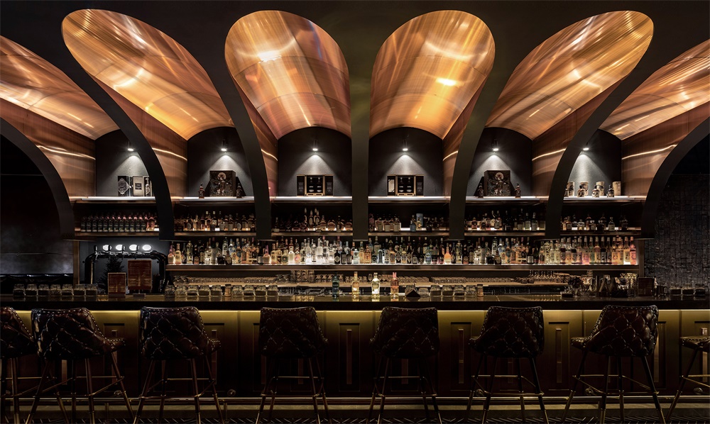
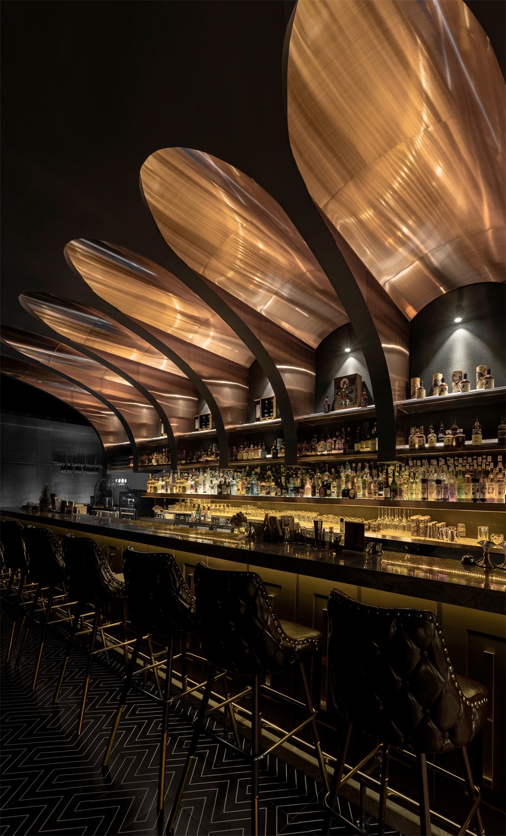
概念源自於製作威士忌的原料(大麥),本空間以“大麥”為主要提煉元素,先由單一的自然形態到組合裂變形態,再由“繁”至“簡”轉換形態並植入到以酒吧中部為核心的主酒架區域,突出為之相聯的主題。泛金色的金屬質感融入到整體空間中,進一步體現威士忌的固有色,並在燈光的映射下顯得流光溢彩,光影之間猶如半畝方塘一鑒開,天光雲影共徘徊。
The concept originated from the raw material (barley) for making whisky. This space takes “barley” as the main extraction element, first from the single natural form to the combined fission form, and then from the “complex” to “simple” transformation form and implanted into the main wine shelf area with the center of the bar as the core, highlighting the related theme. The pan-golden metal texture is integrated into the overall space, further reflecting the inherent color of whisky, and under the map of the light appears to be the light and color, between the light and shadow is like half an acre of a pond, a mirror opened, the sky light and cloud shadow wander togethe.
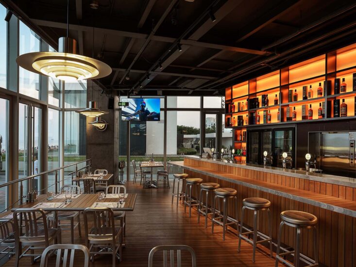
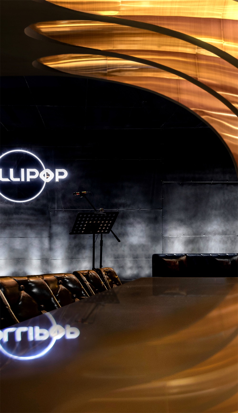
∇ 酒吧概覽 overview ©羅淞元
它複雜,馥鬱芬芳,品味之旅如同走在鋪滿各種鮮花和鮮果的蘇格蘭山坡上;它簡單,簡單到隻需大麥製作就足矣,因為它所向往的極致,“源”就是它的純粹與自然。威士忌(Whisky)這個詞來源於蘇格蘭古語,它是一種由大麥等穀物釀製,在橡木桶中陳釀多年後,調配成43度左右的烈性蒸餾酒,在蘇格蘭已經超過了500年的曆史。對於威士忌而言,剛剛蒸餾出來的初酒(New Make)是無色透明的。我們所著迷的顏色和風味,都來源於之後漫長的橡木桶陳年;其中,賦予威士忌顏色的物質是木桶中的單寧酸和香蘭素。
It is complex and fragrant, and the journey is like walking on a Scottish hillside covered with flowers and fruits. It is simple, as simple as barley production is enough, because it wants the ultimate, “source” is its pure and natural. Whisky, a word derived from an old Scottish word, is a strong distilled spirit made from grains such as barley aged in oak barrels for around 43 degrees for more than 500 years. For whisky, New Make, which has just been distilled, is colorless and transparent. Our fascination with color and flavor comes from the long oak barrel aging that follows; Among the
substances that give whisky its colour are tannins and vanillin found in casks.
∇ 酒吧局部,泛金色的金屬質感融入到整體空間中 partial view of the bar, the pan-golden metal texture is integrated into the overall space ©羅淞元
概念運用轉換而來的穹頂及酒架,猶如金燦燦的麥穗,仿佛在麥田中起舞飛翔。
The concept of the use of converted dome and wine rack, like golden wheat ears, as if dancing in the wheat field.
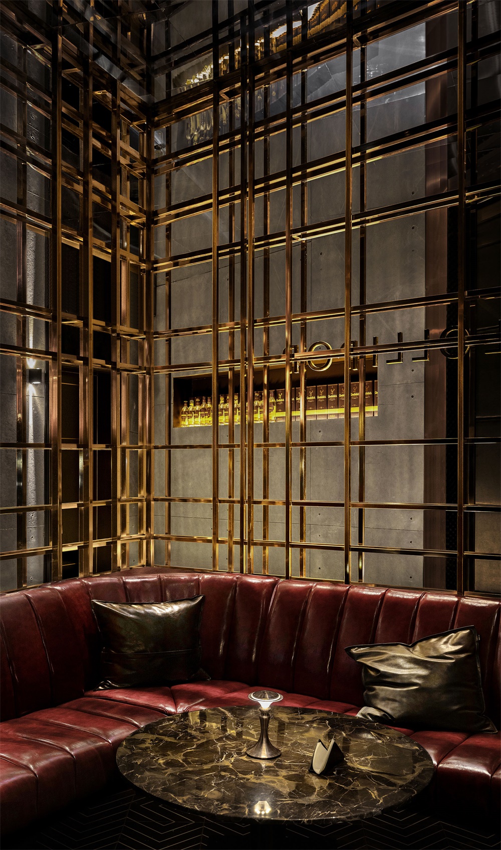
∇ 落座區局部 partial view of the seating area ©羅淞元
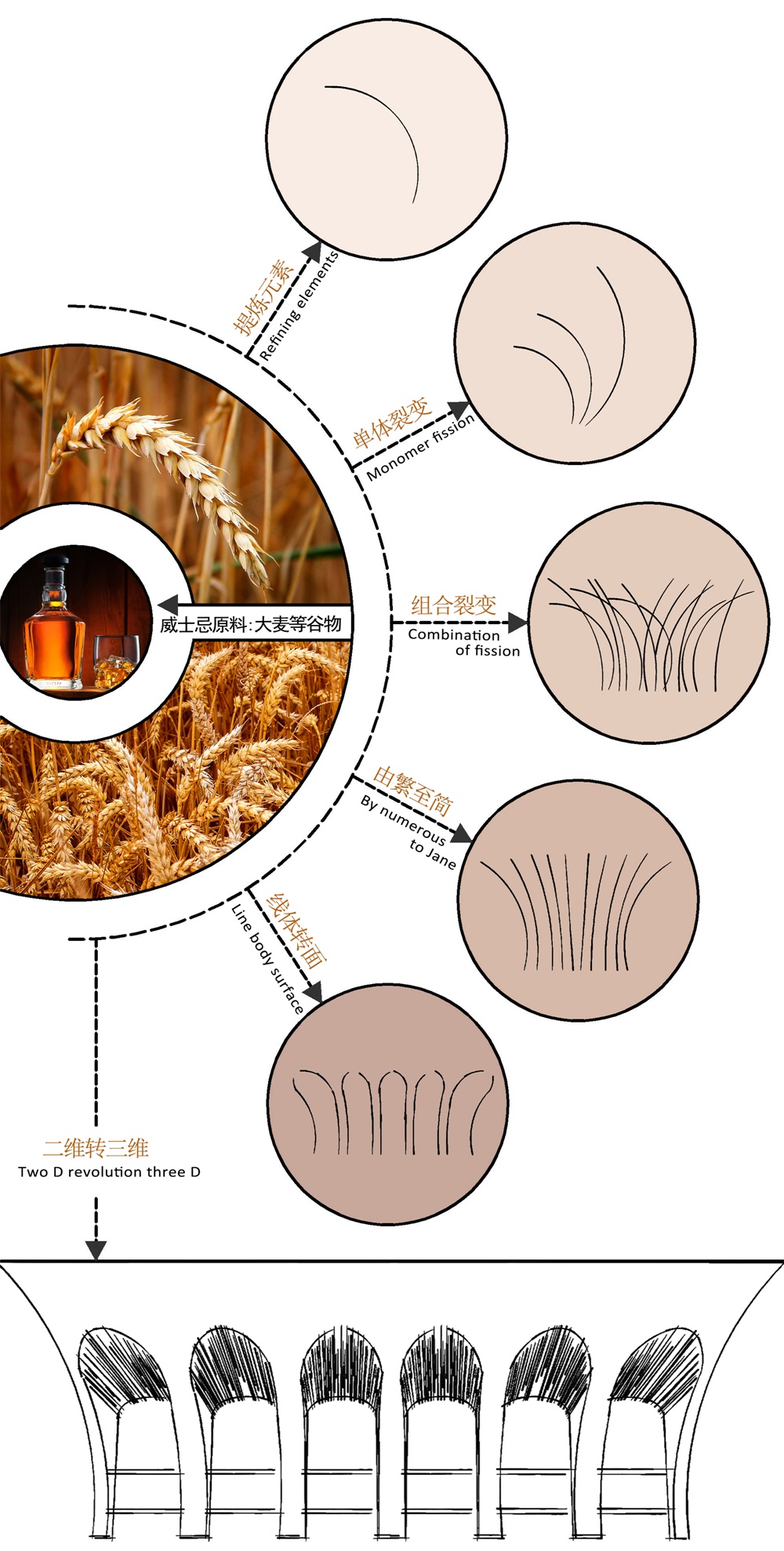
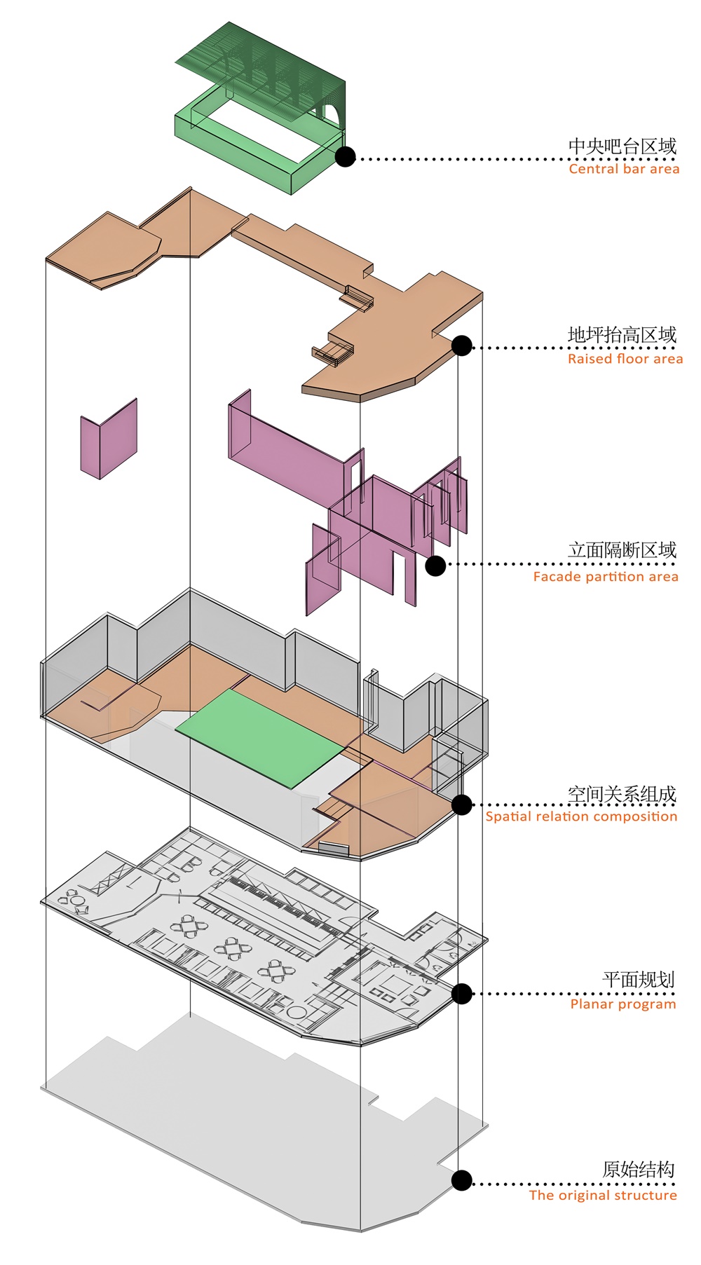
空間概念分析示意圖 + 空間解構分析示意圖
Schematic diagram of spatial concept analysis + Schematic diagram of spatial deconstruction analysis
∇ 概念分析圖 the concept diagram©羅淞元
∇ 空間解構圖 the exploded axon©羅淞元
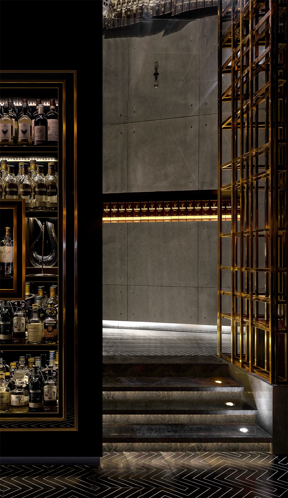
入口區域 THE ENTRANCE AREA
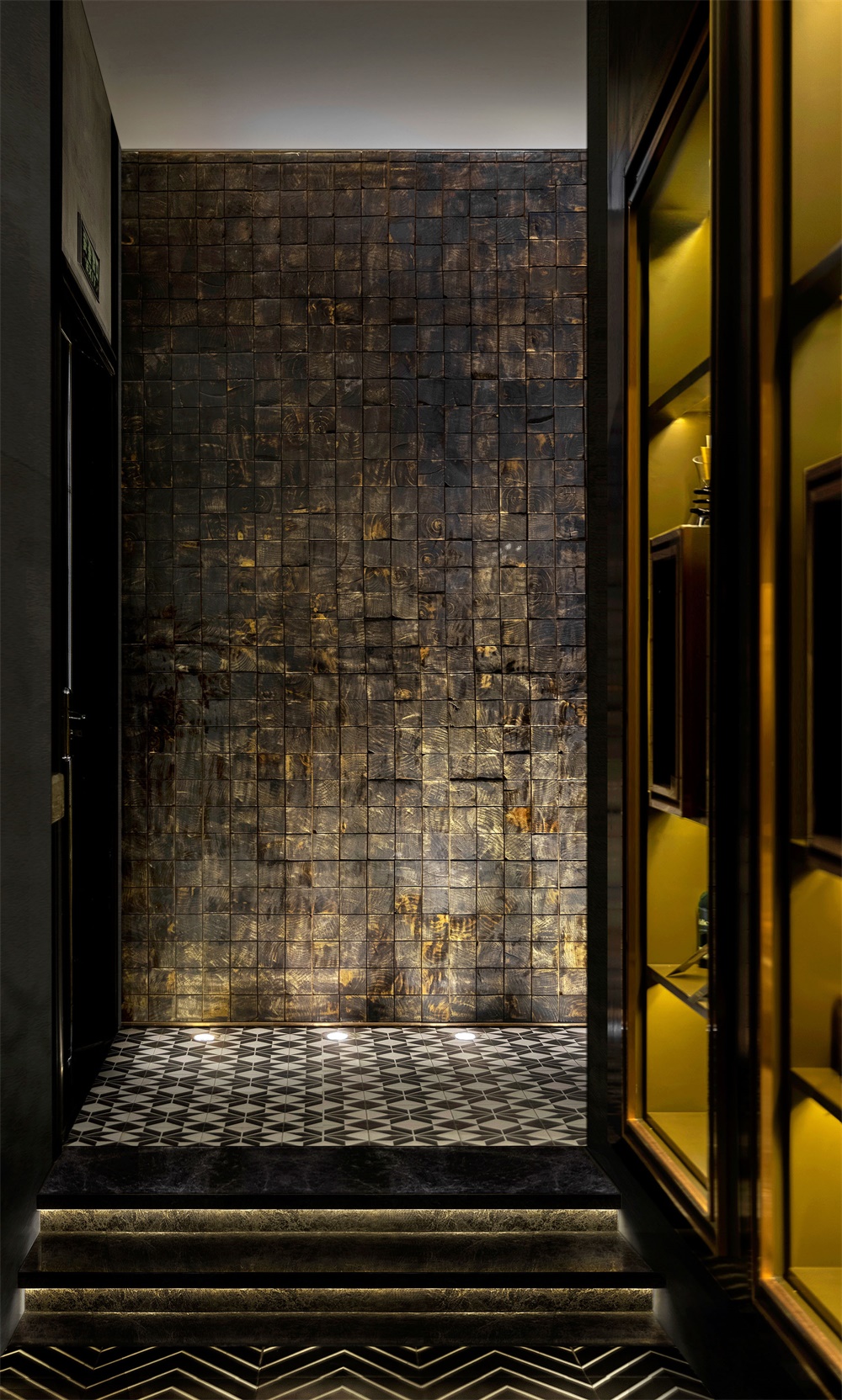
基於場地內與主入口外的地平線有高低落差之因,故在入口的過渡空間中增加了台階,同時利用地麵燈光與半透的金屬隔斷變換在光與影之間,增加了空間虛與實的層疊感,使動態線循序漸進,既保證了主入口的完整性也提煉了酒吧的私密性。
Based on the field and outside the main entrance of the horizon because of a fall of on any account, therefore increase the steps in the transition of entrance space, at the same time use the metal ground lights and a semipermeable partition transformation between light and shadow, and the space increased cascade of virtual and real feeling, make the dynamic line step by step, not only ensure the integrity of the main entrance and refine the illicit close sex of the bar.
∇ 在入口的過渡空間中增加了台階,同時利用地麵燈光與半透的金屬隔斷增加了空間虛與實的層疊感 increasing the steps in the transition of entrance space, and using the metal ground lights and a semipermeable partition to create the cascade of virtual and real feeling ©羅淞元
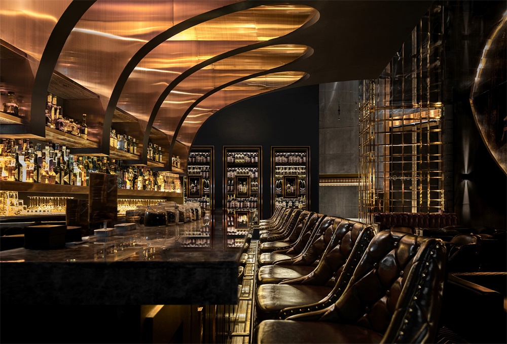
中央主酒架/吧台區域 CENTRAL MAIN BAR/BAR AREA
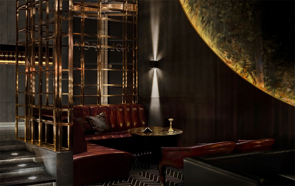
在整個空間的視覺上以黑/金色為主基調,營造一種神秘的高貴感。黑/金色的搭配與碰撞一直是時尚界的寵兒。黑色,作為一個強大的色彩,它可以很莊重也可以很高雅,是一種具有代表多種不同文化意義的顏色。金色是金屬金的顏色,具有光澤,它是大自然中至高無上的純色,象征太陽的顏色,代表著溫暖與幸福。本空間的金色概念更多的是為了體現威士忌酒本身的固有色,在不同的燈光呈現下映射出不同的金色,也如同表達一種不同年份的威士忌酒該有的色彩。
On the vision of whole space with black/aureate give priority to fundamental key, build a kind of mysterious noble sense. Black/gold matching and collision has always been the darling of the fashion world. Black, as a powerful color, can be solemn or elegant, and is a color that represents many different cultural meanings. Gold is the color of metallic gold, with luster. It is the supreme solid color in nature, symbolizing the color of the sun, representing warmth and happiness. The concept of gold in this space is more to reflect the inherent color of whisky itself. Different golden colors are reflected in different lights, which is like the color of whisky of different years.
∇ 中央主酒架/吧台區域,整個空間的視覺上以黑/金色為主基調 the central main bar area, on the vision of whole space with black/aureate give priority to fundamental key ©羅淞元
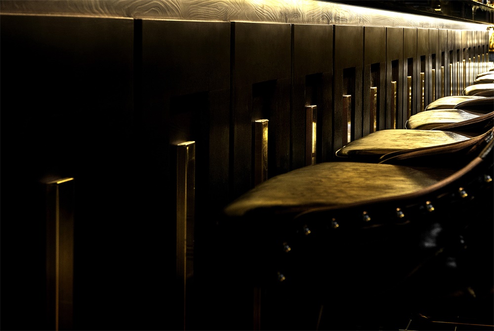
∇ 吧台區細節 details of the bar area ©羅淞元
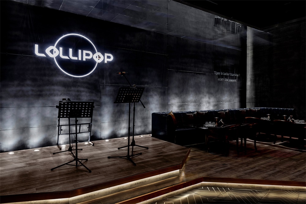
爵士樂舞台區域 JAZZ ARENA AREA
地麵射燈映射在黑色肌理牆上形成的光束,猶如時光隧道,帶人一種具有想象空間的畫麵。舞台區域的純灰色調與空間周邊的暖色調形成一種鮮明的色彩對比,它的角色是扮演著這個舞台表演者的配角,它不需要喧兵奪主,它把最好的色彩與時光留給舞台的主角。
The light beam that the ground spotlights map on the black texture wall is like a time tunnel, bringing a kind of picture with imagination space. The pure grey tone of the stage area forms a bright color contrast with the warm tones around the space. Its role is to play the supporting role of the stage performers. It does not need the small troops to seize the main role.
∇ 舞台區域的純灰色調與空間周邊的暖色調形成一種鮮明的色彩對比 the pure grey tone of the stage area forms a bright color contrast with the warm tones around the space ©羅淞元
威士忌與鹿的故事 WHISKEY AND THE DEER
在本案設計中,空間牆壁以“鹿”為軟裝飾,進一步映襯著威士忌酒的起源故事,並在天花鏡麵的反射下勾勒出橢圓的虛實空間,如同小鹿在開放與自由的天地中奔跑。“鹿”是蘇格蘭高地的常見物種,在森林與草原文明時代中,它被賦予祥瑞、權威、力量、優雅與神秘的象征,也象征著蘇格蘭人民為了自由,與統治者不屈不撓鬥爭的故事。“鹿”作為蘇格蘭威士忌酒中常見的標識,也更具獨特的地域文化特色。
In the design of this case, the space wall is soft decorated with “deer”, which further reflects the origin story of whisky, and draws the outline of the oval virtual and real space under the reflection of the ceiling mirror, just like the deer running in the open and free world. “Deer” is a common species in the Scottish highlands. In the forest and grassland civilization, it was endowed with auspicious, authoritative, powerful, elegant and mysterious symbols. It also symbolizes the story of the Scottish people’s indomitable struggle against the rulers for freedom. “Deer” as a common logo in scotch whisky, but also more unique regional cultural characteristics.
∇ 空間牆壁以“鹿”為軟裝飾 the space wall is soft decorated with “deer” ©羅淞元
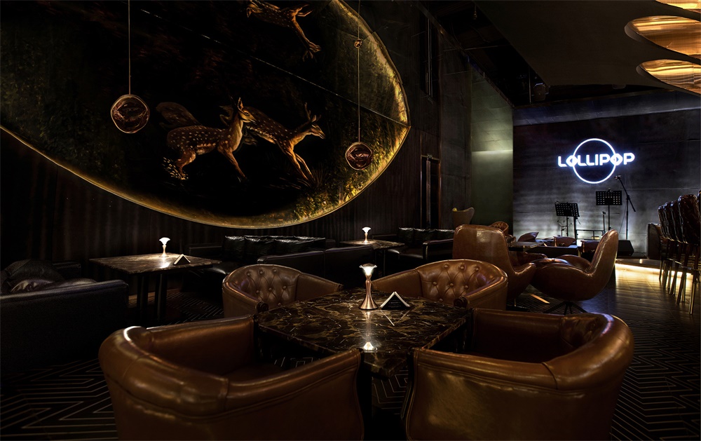
∇ 牆麵局部及落座區 the wall surface details and the seating area ©羅淞元
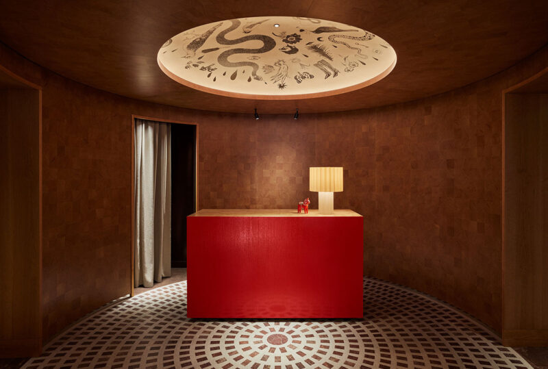
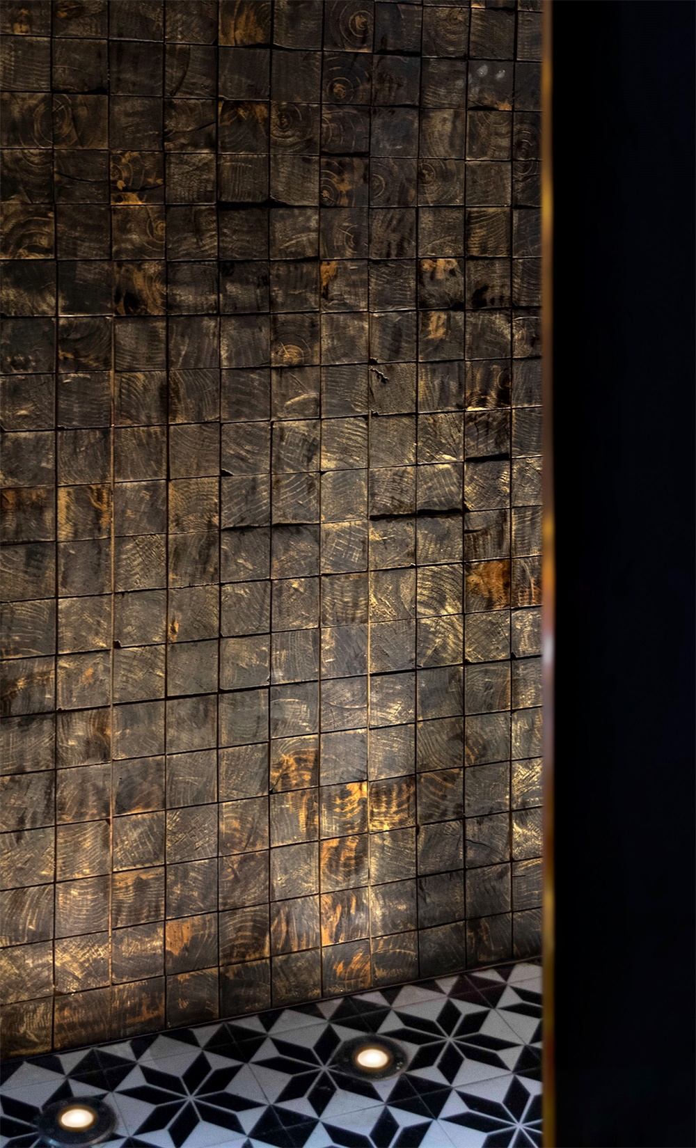
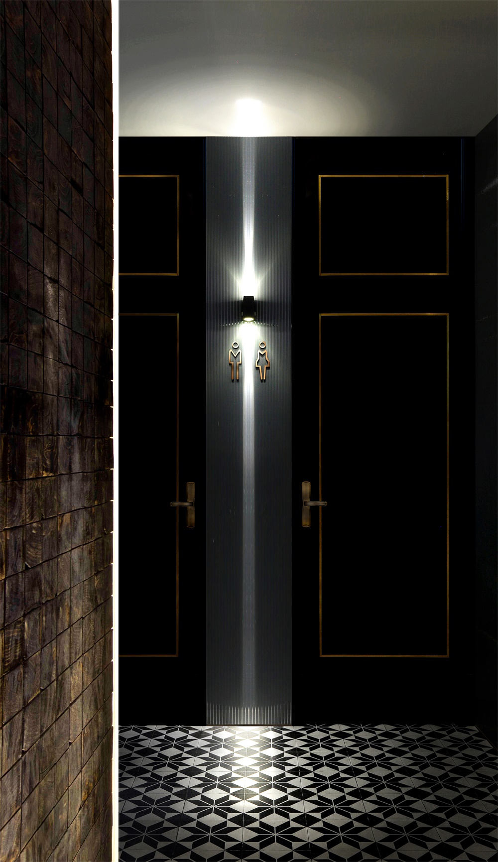
中轉區域 TRANSIT AREA
在進入洗手間之前的過渡空間中,以橡木做舊色為元素的裝飾牆並結合燈光,如同醞釀威士忌酒的“橡木桶陳年”,在經過歲月中的洗禮、醞釀、成長、蛻變、成熟,最終驚豔地出現在人們的目光中,接受大家的讚美,同時也傳達著一種自然生態的理念。
Before getting into the bathroom of the transition space, make the decoration of the old color as elements in oak wall combined with lighting, like brewing whisky “oak aged”, after years of baptism, brewing, growth, transformation, mature, eventually jing to appear in people’s eyes, accept everyone’s praise, it also conveys a feeling of a kind of natural ecological concept.
∇ 以橡木做舊色為元素的裝飾牆細節 details of the oak wall with the decoration of the old color ©羅淞元
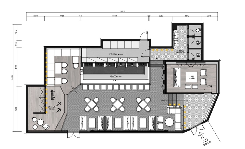
平麵布置圖Interior design plan
以“大麥”概念轉換的中央吧台區,並結合以“小鹿”為概念的軟裝飾,從而延展到威士忌酒的起源故事,設計師羅淞元希望傳達給此空間的體驗者一種生活場景:將這裏的“大麥”所生長的田野與自然引入,營造出一種此處安心,便是吾鄉的生活場景。
Barley “concept transformation in the middle of the bar area, combining with” the deer “for the concept of soft adornment, thus extending to the origin of the whisky, the designer Luo Song yuan want to convey to the experience of this space is a scene of life: will the” barley “the introduction of the growth of the field and nature, and create a comfortable here, life is my hometown.
∇ 平麵布置圖 layout plan ©羅淞元
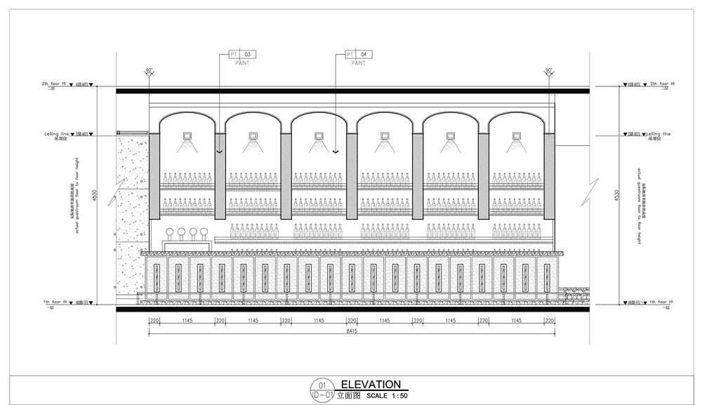
∇ 立麵圖 elevation ©羅淞元
主要項目信息
項目名稱:貴陽LOLLIPOP威士忌酒吧
業主單位:貴州蘿莉婆婆文化娛樂有限公司
項目地點:貴州省貴陽市南明區機場路18號亨特國際(索菲特酒店)一樓
室內設計:DDID鼎點室內設計(深圳)
主筆設計:羅淞元
專案設計:張俊峰
設計團隊:胡楊、夏永昊、劉子健、陳明輝
建築麵積:230㎡
完工時間:2019年10月
主要材料:古銅不鏽鋼、水泥板、鏡麵鋁扣板、花磚
Project name:Guiyang LOLLIPOP whiskey bar design
Owner unit:Guizhou girl mother-in-law culture entertainment co., LTD
T Project location: 1 / f, hunter international (sofitel hotel), no. 18, airport road, nanming district, guiyang city, guizhou province
Interior design:DDID tripod point interior design (shenzhen)
Main pen design:Luo songyuan
Project design:zhang junfeng
Design team:poplar, xia yonghao, liu zijian, Chen minghui
The building area is:230㎡
Completion date:October 2019
Main material:copper stainless steel, cement plate, mirror aluminum gusset plate, tile
設計師羅淞元:畢業於深圳大學藝術設計學院,DDID設計總監/高級室內設計師;從業十載,其設計作品屢獲設計大獎,堅持從理解產品核心特性出發,以研究的態度做設計,透過空間結構而延展到燈光與色彩分析,善於打造具有時間延伸性的空間作品。
DDID鼎點室內設計(深圳)是一家具有國際設計視野的設計機構,設計業務涵蓋商業/會所/餐飲/辦公空間等領域,秉承“以人為本”的設計理念,追求人/空間/自然的平衡,結合品牌/商業/人群及定位需求,為客戶提供全方位和定製化的解決方案。