全球設計風向感謝來自 MOC DESIGN OFFICE 的商業空間/美甲店項目案例分享:
“羽衣”之下的美業空間蛻變
The Feathery Transformation
HAIYI NAIL 深圳萬象天地店
HAIYI NAIL, The Mixc World Shenzhen
美甲店作為一個塑造美的地方,其空間設計和品牌策略,亦跟隨著用戶的不斷更替、時代變遷下的審美觀而不斷進化。
The nail salon is a place where beauty is created. Its space design and brand strategy evolve with the ever-changing aesthetics of the times.
MOC DESIGN受邀為本土品牌海怡美甲進行係統性的設計重塑,通過對品牌形象的整體規劃和設計,關注品牌所處時代環境的變化,在維護原有客群的同時,也針對更年輕的消費群做出大膽改變。創造性地將象征著自由與美好的“羽毛”概念,落地成為想象與現實的精妙結合點,演繹出涵蓋平麵視覺、參與感的空間體驗及至人文美學的一次品牌煥新。
MOC DESIGN was invited to rebrand HAIYI NAIL systematically. The overall planning and design of the brand image focus on the changes of the current era and environment. It aims to retain the current customer groups while targeting at the younger customer groups by making bold changes. The creative concept of “Feather” symbolizes freedom and beauty. Its implementation is the subtle combination of imagination and reality. A refreshing brand is felt through the graphic visuals, engaging spatial experience and humanistic aesthetics.
∇ 空間概覽 Overview
01 源自不同膚色的平麵視覺係統
A graphic visual system derived from different skin tones
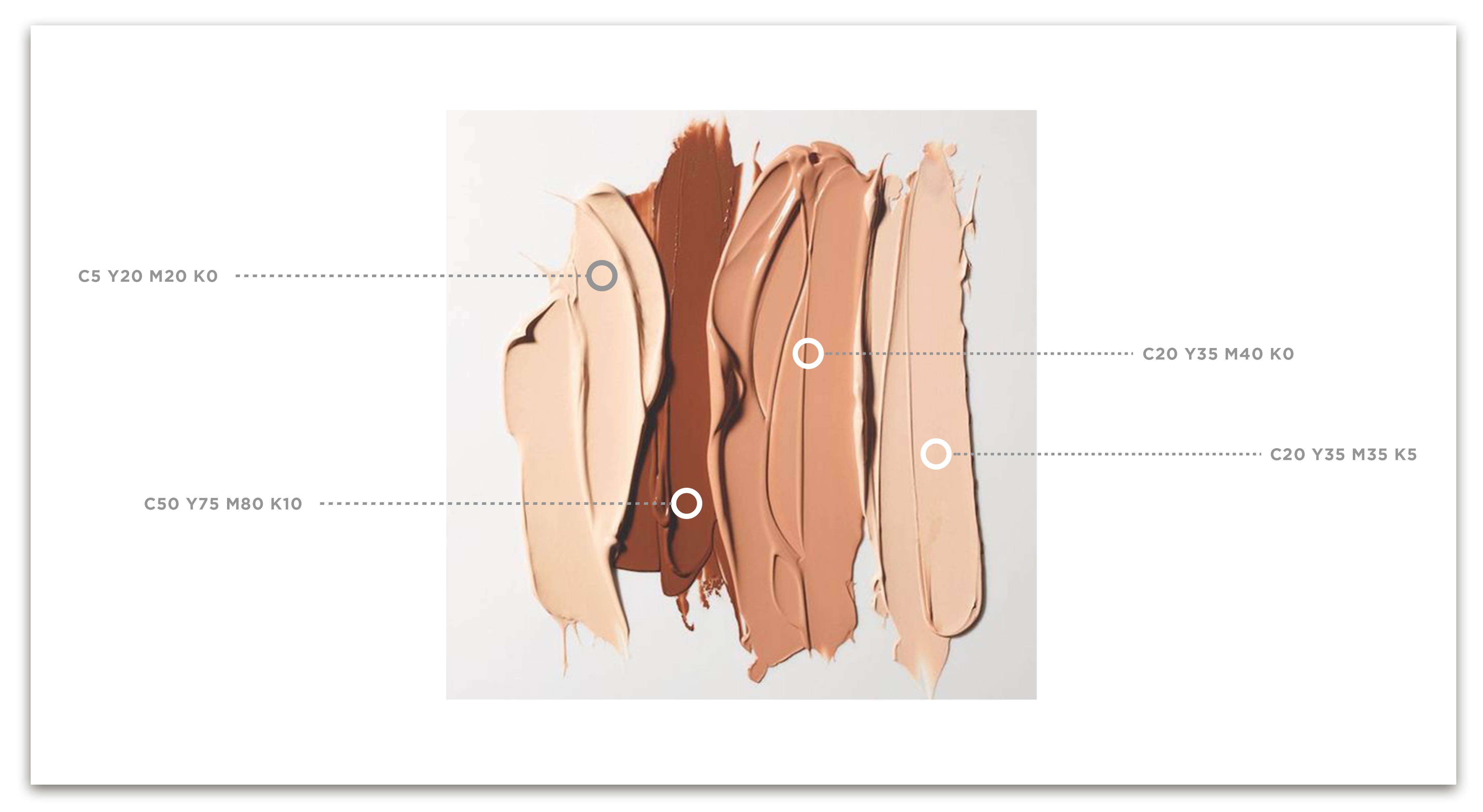
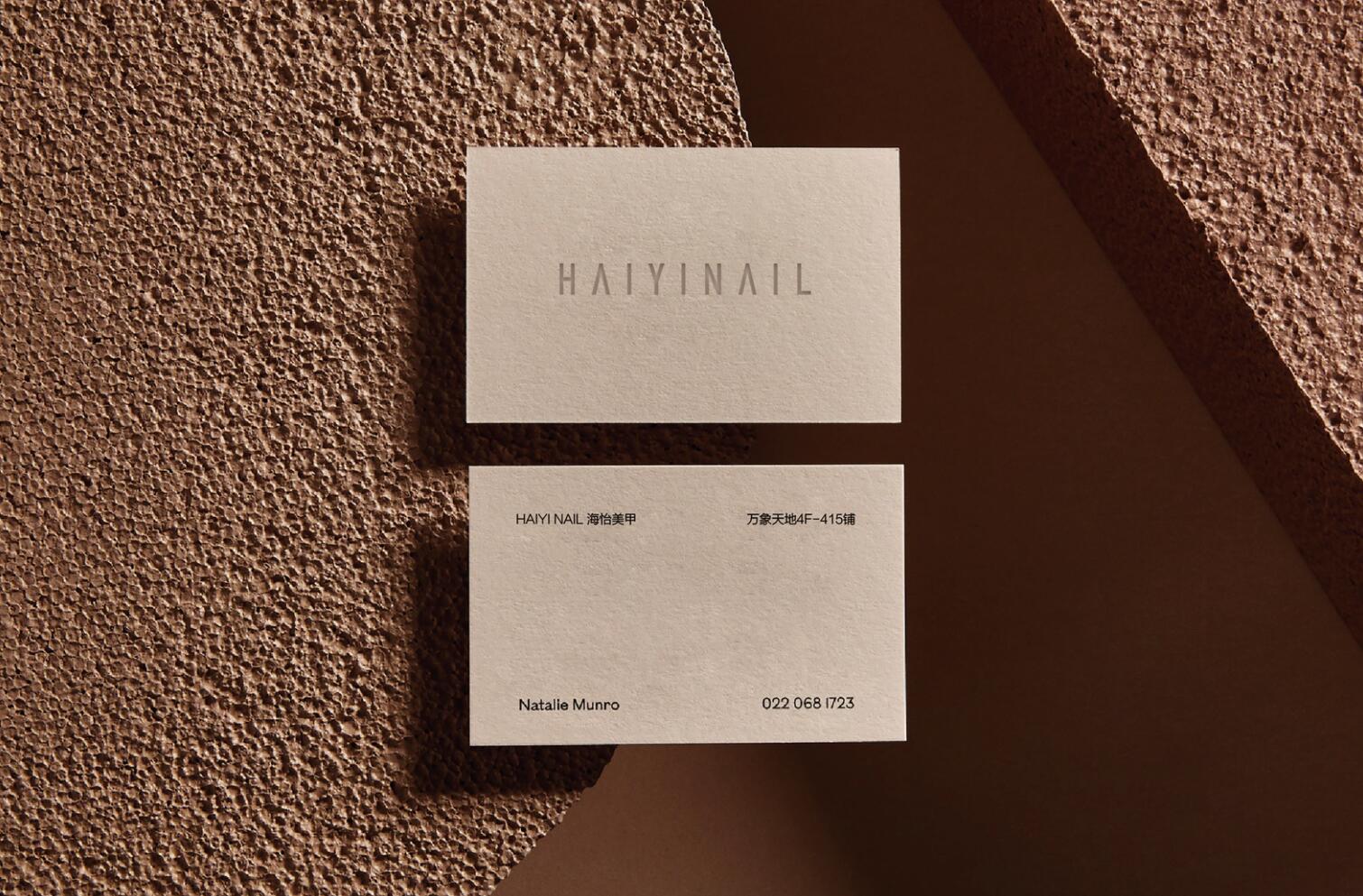
品牌視覺部分,MOC以更加簡化的字形為基礎構成其標誌,予人中性優雅的視覺印象。色彩上,則從不同膚色女性粉底液的色彩中,提煉出色彩係統方案,奠定了包容、優雅的精神氣質。
For the visual design of the brand, MOC DESIGN adopts fonts in a more simplified style, giving a neutral and elegant visual impression. In terms of colors, a color scheme is finely drawn from the foundation colors for women with different skin tones, which establishes the quality of inclusiveness and elegance.
∇ LOGO
∇ 色彩係統概念 Concept of color system
02 “破繭而出”的布局優化
An optimized layout of “metamorphosis”
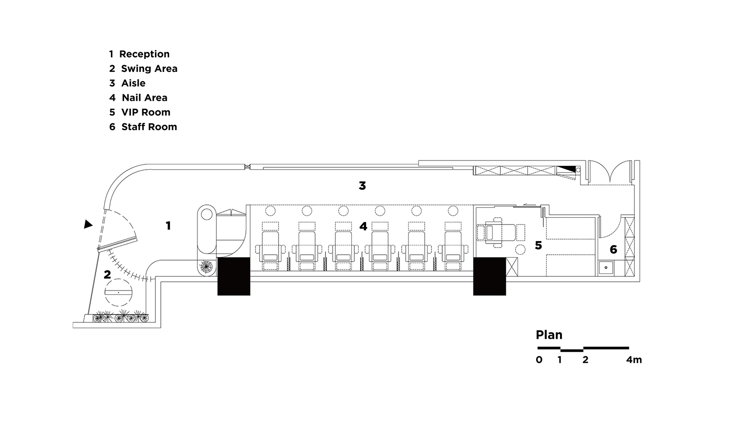
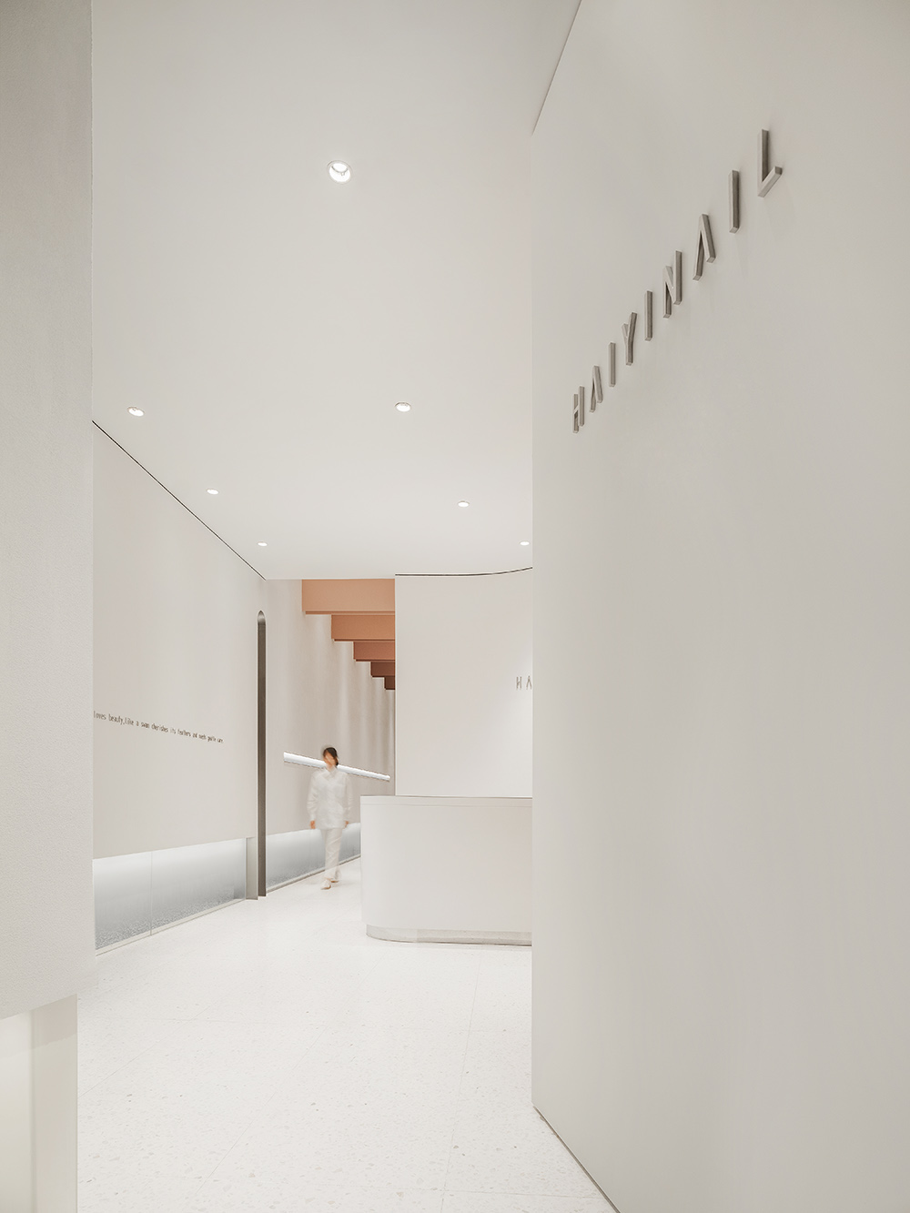
項目坐落深圳潮流商業地標萬象天地,聚集了高端商戶和優質客群,但店鋪自身的場地條件卻極具挑戰性:場地呈長條形,寬僅4米,且近三分之一的麵積被硬性劃定為消防通道。這意味著90平方米的總體空間,實際可用麵積僅餘60平方米。
The project locates in the Mixc World Shenzhen, a trendy commercial landmark in Shenzhen. The mall gathers high-end merchants and high-quality customers. But the site itself is a big challenge – a long strip with a width at 4 meters, nearly 1/3 of the area is rigidly designated as a fire escape. This means out of a total space of 90 square meters, only 60 square meters are usable.
∇ 平麵圖 Floorplan
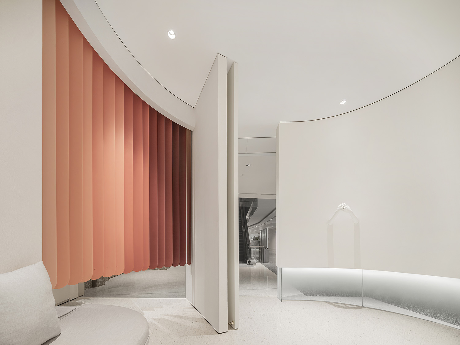
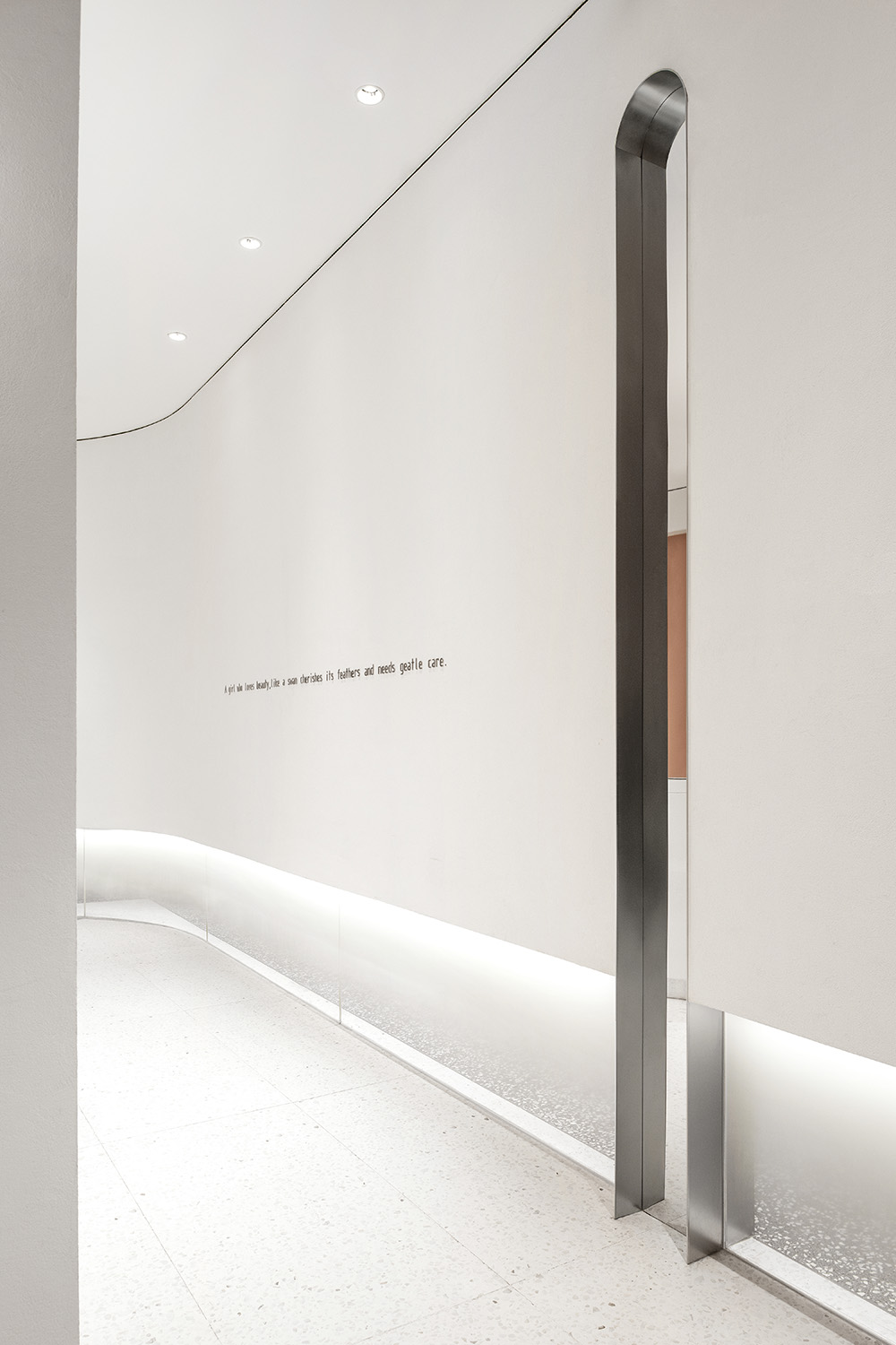
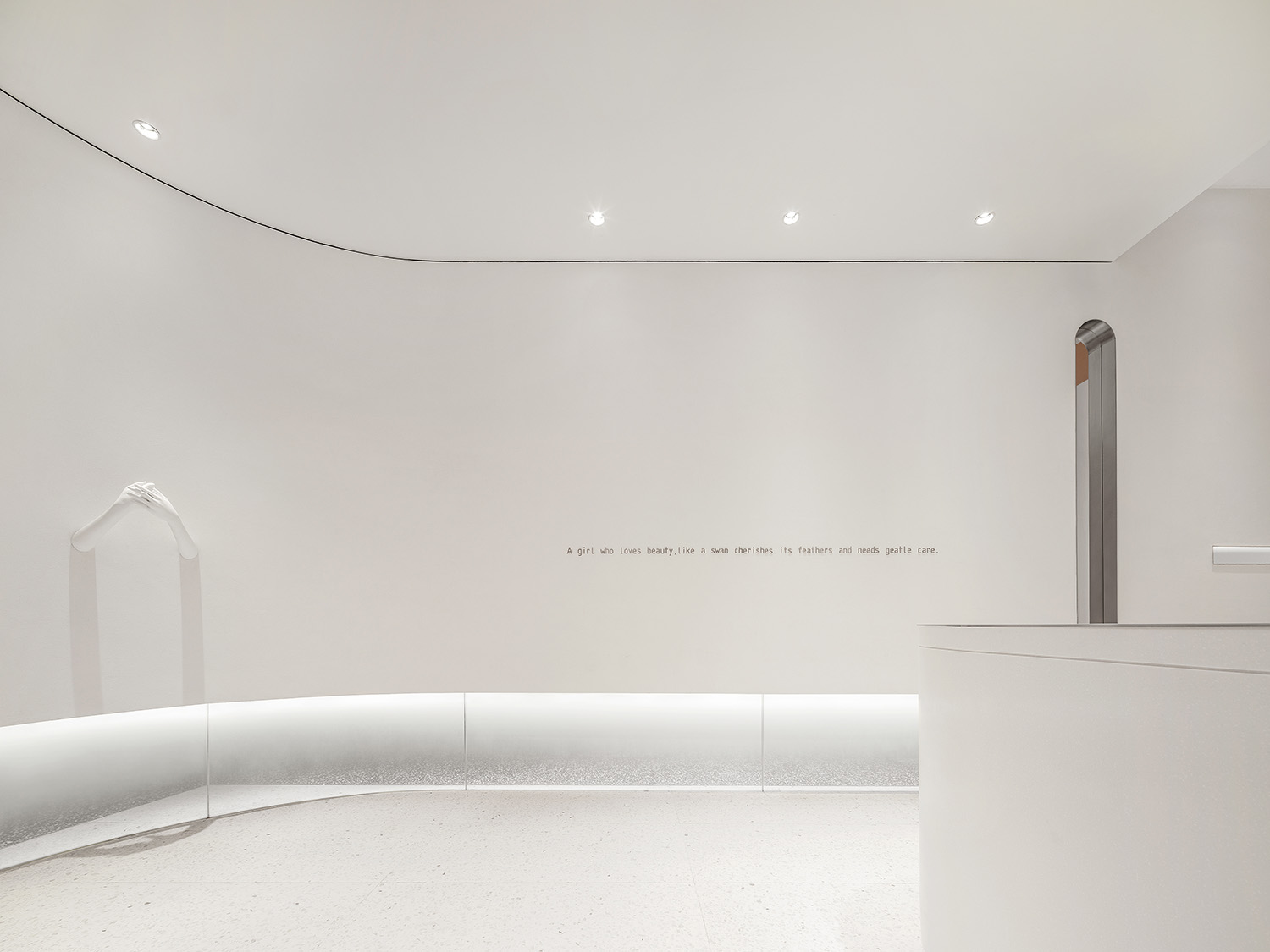
為破除窄長型空間導致感官的壓抑和不適,設計師將原先封閉的牆體改為吊掛式的牆體,底部的漸變玻璃讓原本封閉的空間具有透氣感的同時兼顧了私密度的需求。
To break away from the oppression and discomfort in a long and narrow space, the designer changed the closed wall into a hanging wall, with the gradient glass at the bottom bringing out the transparency and breathability of the closed space while fulfilling the need for privacy.
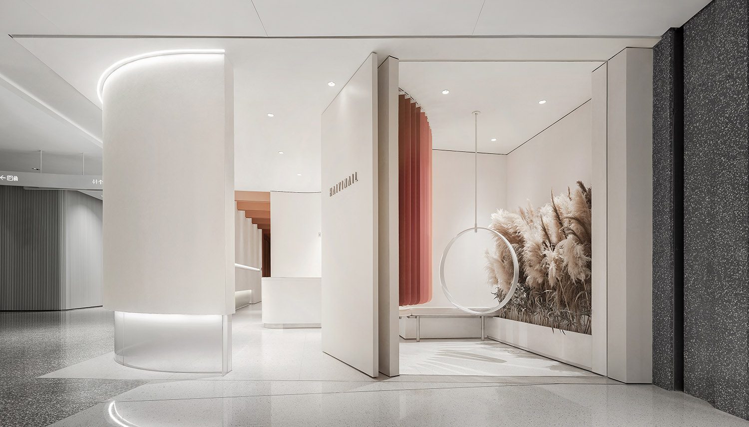
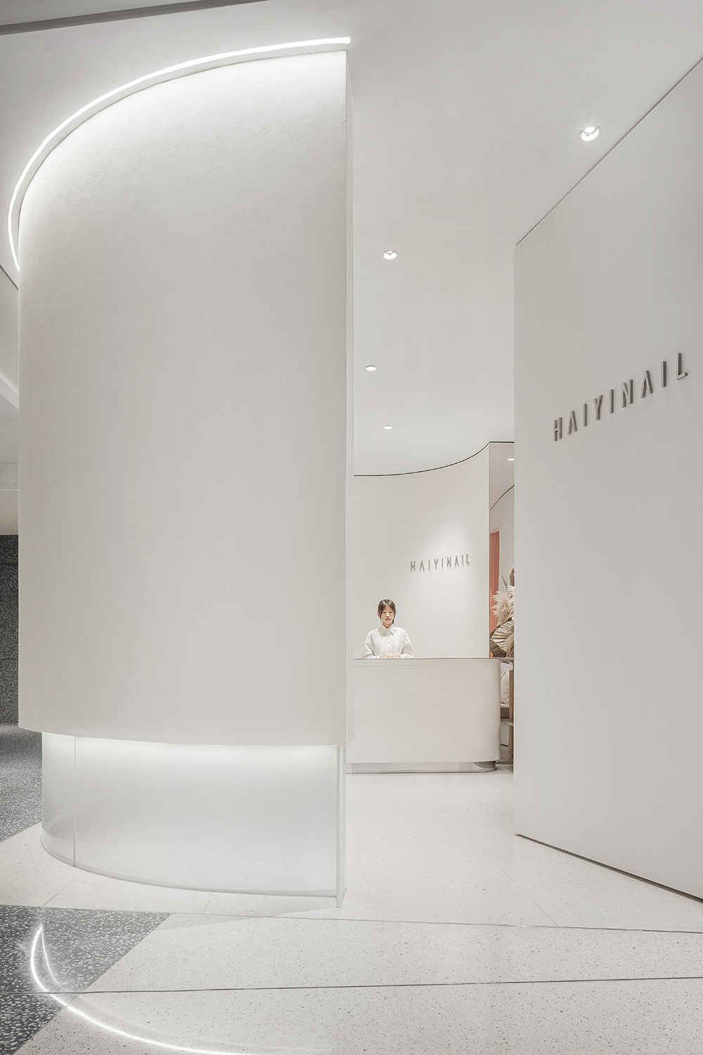
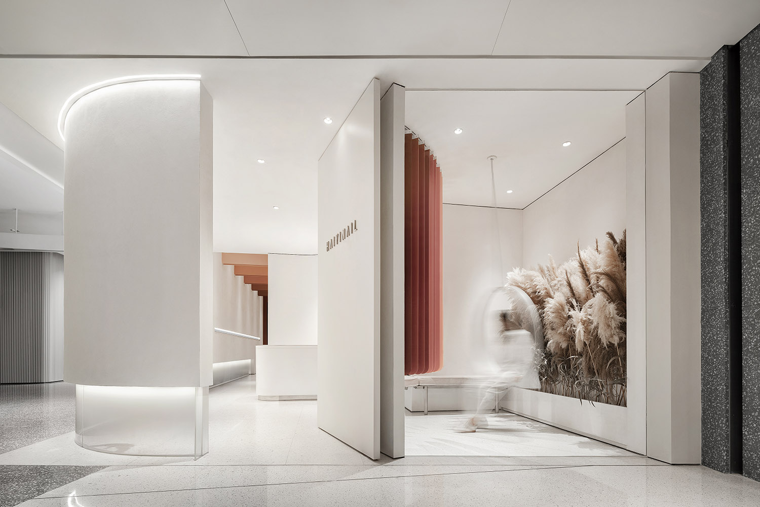
如母體般的繭狀空間形態緩解了顧客的距離感,傾斜的旋轉門既充當品牌入口導視,又巧妙地將櫥窗區與等候區隱性分隔。
The mother-like cocoon space eases the sense of distance for customers. The tilting revolving door serves as a brand guide while subtly separating the window area from the waiting area.
∇ 具有包裹感的繭形外觀結構 The hugging cocoon-shaped façade
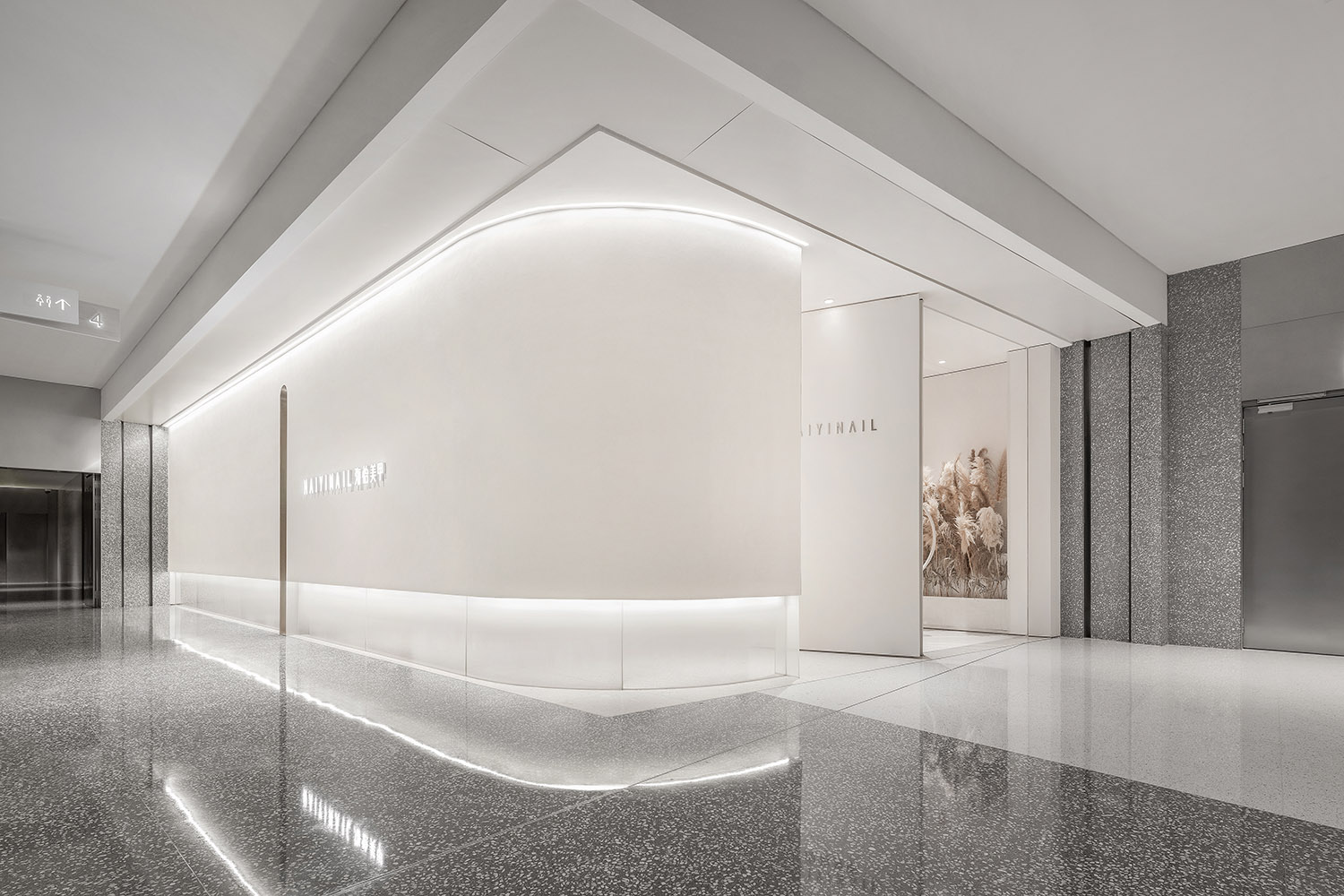
∇ 從入口處看向室內 Looking into the interior from the entrance
∇ 傾斜的旋轉門呈現出友好的姿態 The tilting revolving door is friendly and engaging
03 “體表賦羽”的場景詩意
The poetic feathery look
自然界中所蘊含的造物智慧,往往能夠激發創作的靈感。身披一襲潔白羽毛的天鵝,早已成為人類文化中優雅與美麗的圖騰,在現代商業社會更是經典的時尚意象。本案概念源自於“天鵝的羽毛”:天鵝被喻為“女神”,而羽毛象征著女性的指甲和皮膚的延伸。
The wisdom of creation in nature is often inspiring. The white feathered swan has long been a totem of elegance and beauty in human culture, and is a classic fashion icon in modern commercial society. The concept of this project is derived from the swan’s feather – the swan likened to the goddess and the feather symbolizing women’s nails and skin.
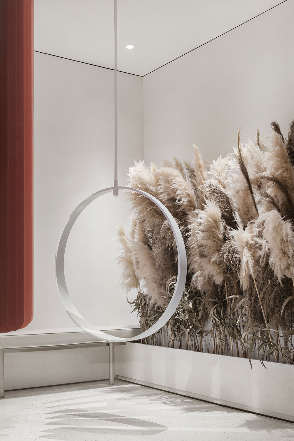
∇ 櫥窗區以永生植物繪製“漸變的羽毛”主題背景,結合喚起女孩童年回憶的定製秋千,營造獨特的自媒體傳播打卡點。
The window area is decorated with immortal plants to achieve the theme of “gradient feather”. It’s also combined with a custom swing that evokes a girl’s childhood memories. It’s created to be a unique Instagrammable spot.
空間設計中抽象化運用羽毛的輕盈與回旋形態,並將不同膚色女性粉底液的色彩係統提煉為低飽和度的用色方案,共同構建包裹性的舒適空間感受。
The lightweight and whirling form of feather is abstractly blended in the space design. The color system of foundations for women with different skin tones is refined into a low-saturation color scheme. Both attributes help to create a comfortably hugging space experience.
∇ 櫥窗和空間色彩 Window and space colors
∇ 羽毛般的漸變百葉分隔了櫥窗與等候區
Feather-like blinders in gradient colors separate the window and waiting area.
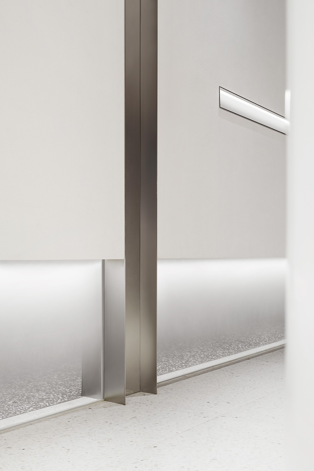
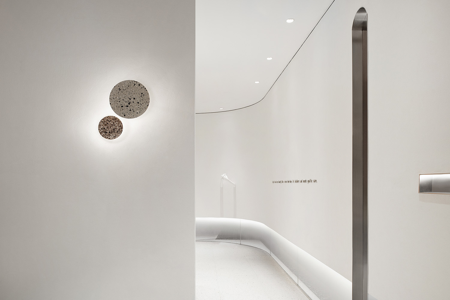
∇ 空間細節 Space details
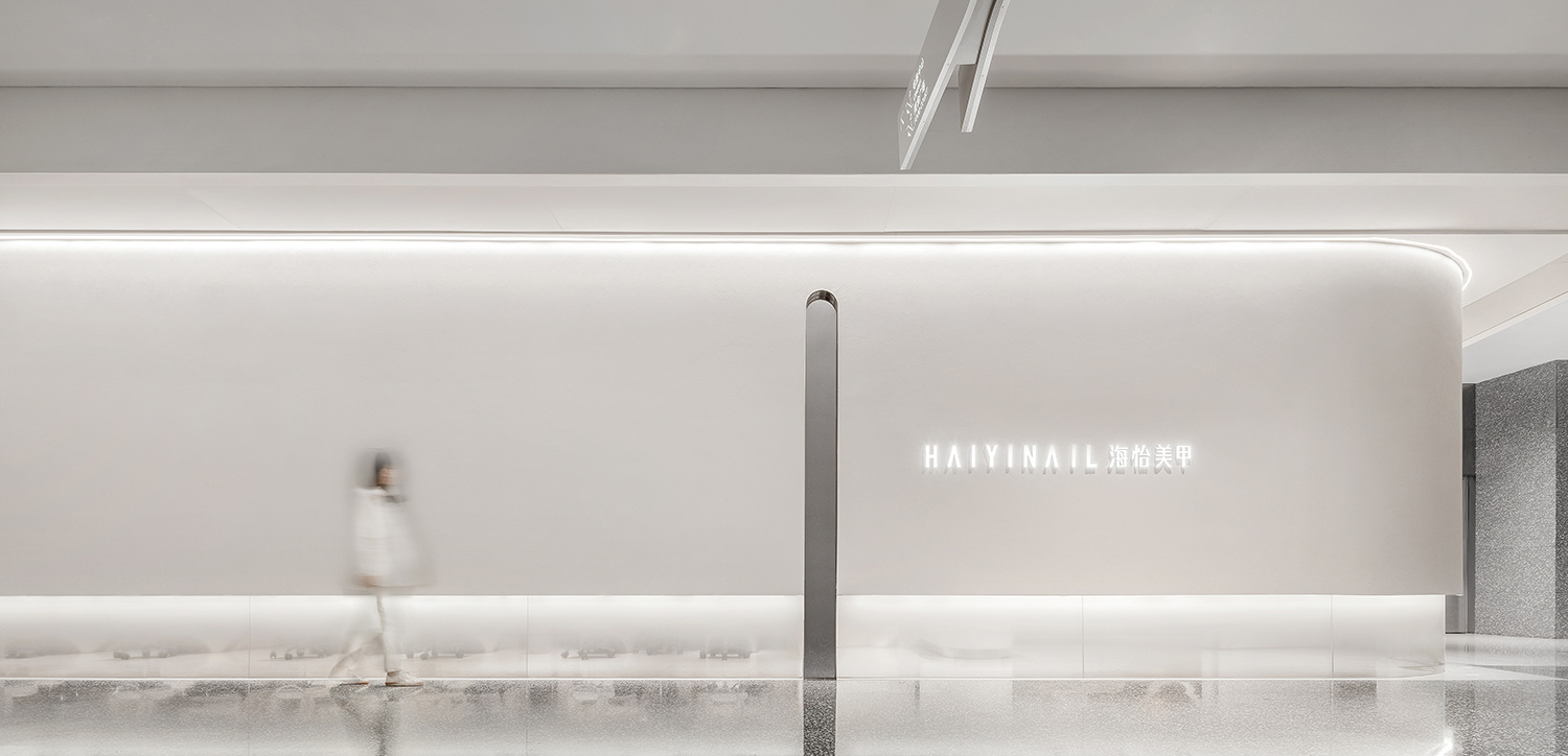
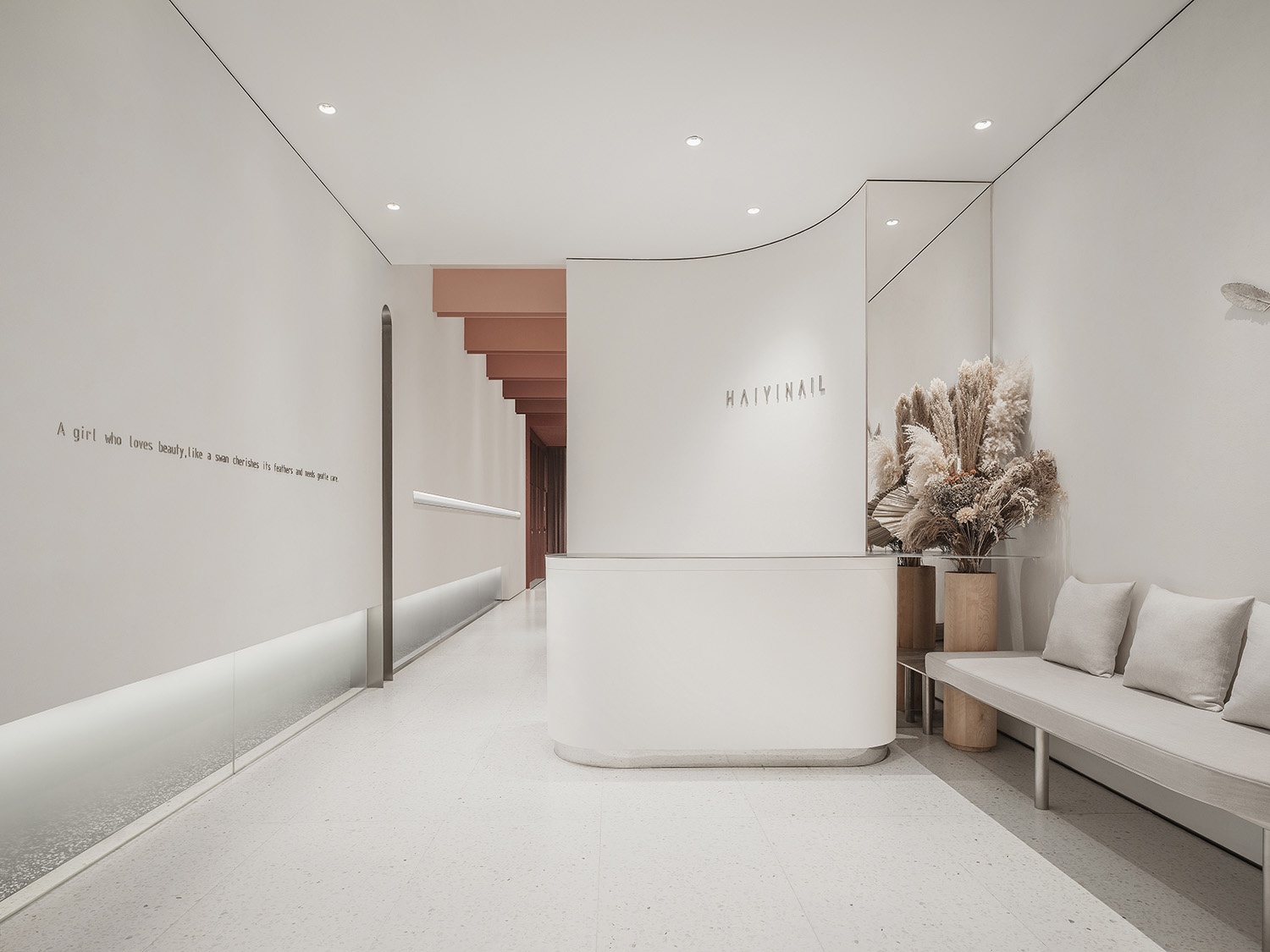
∇ 接待區 Reception
∇ 空間細節 Space details
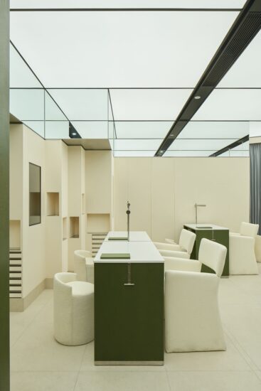
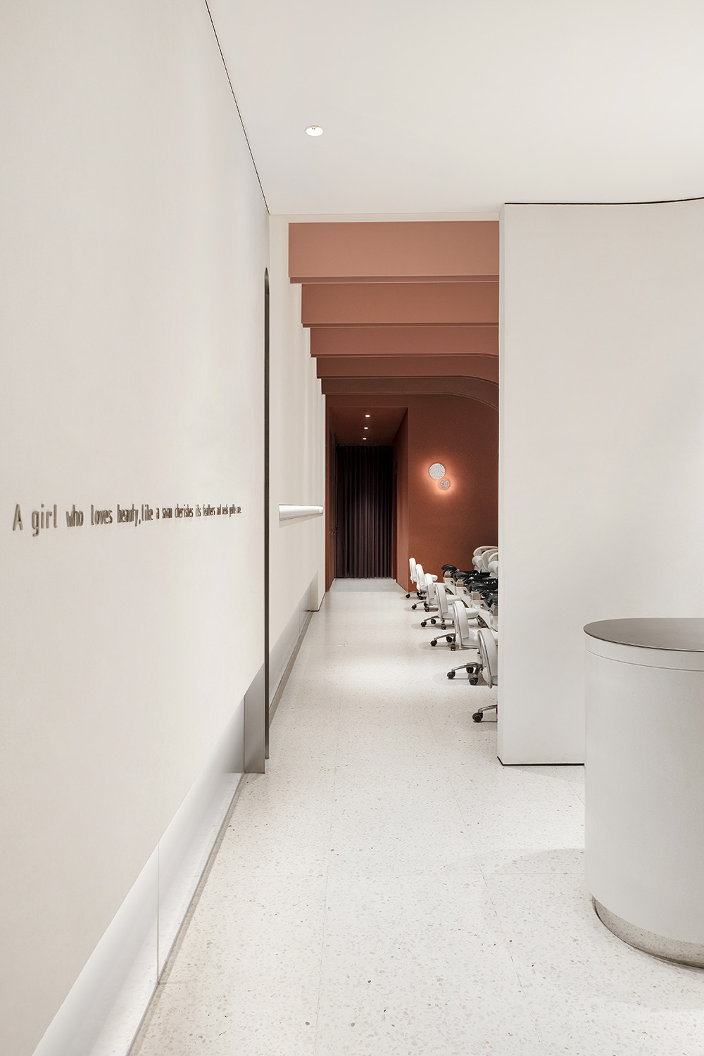
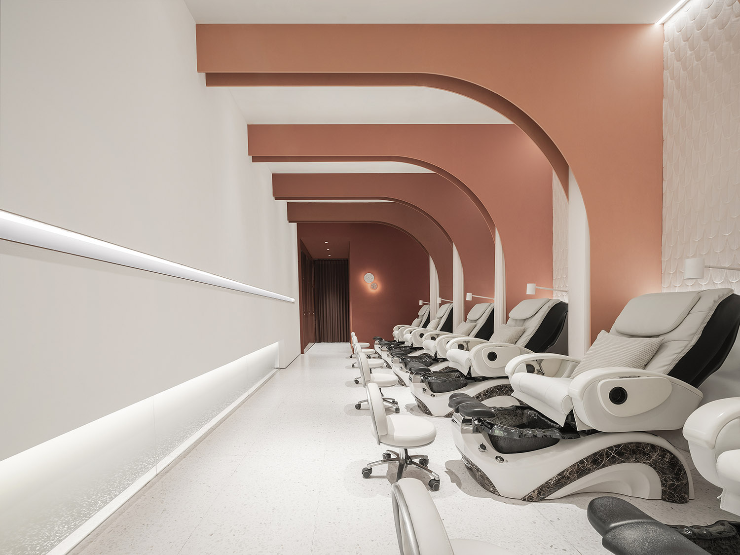
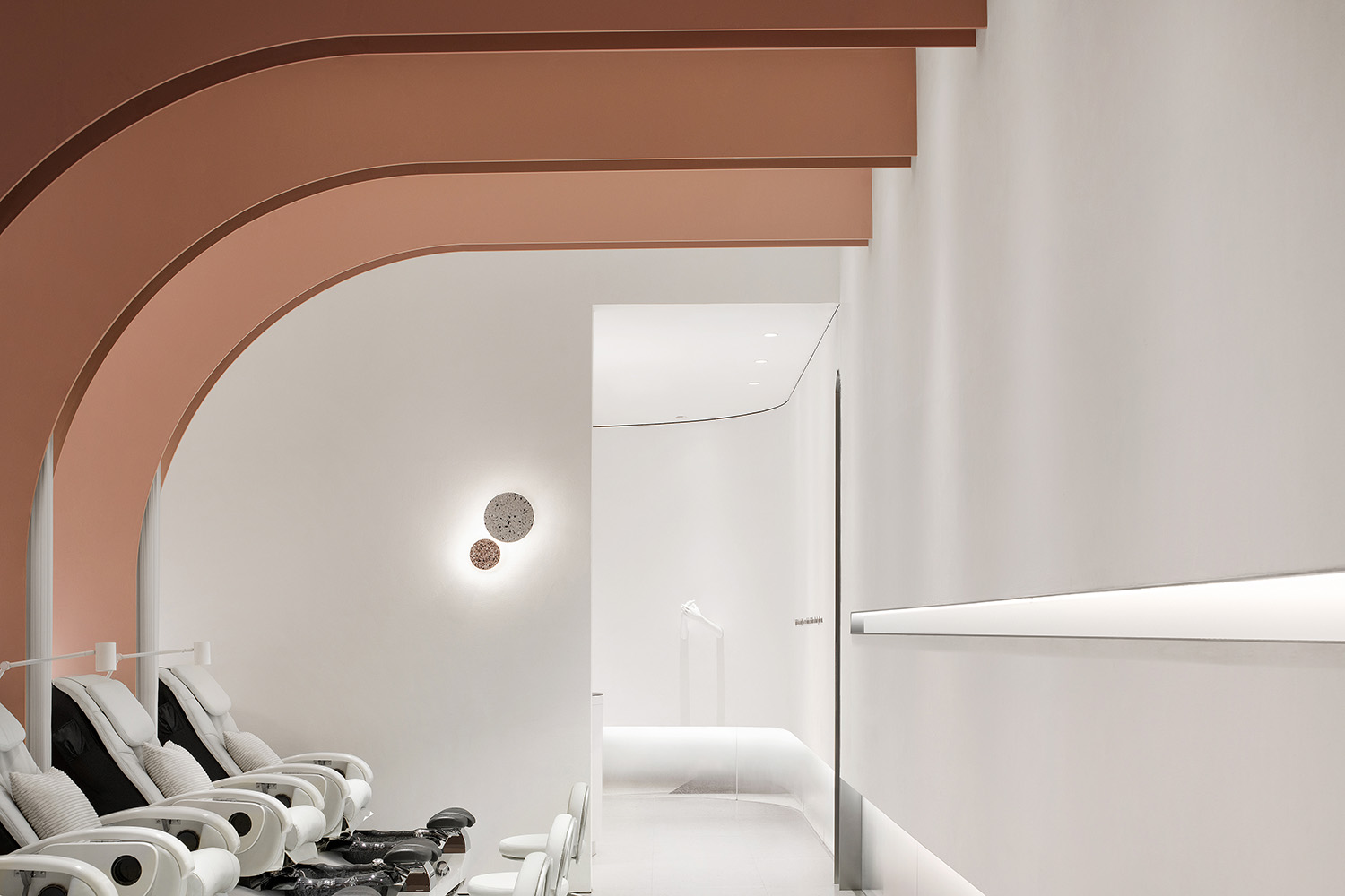
拱形和弧麵元素貫穿於內部空間,從白色人造石飾麵的弧形接待台,延續至美甲區如羽毛般序列伸展的拱形隔斷,斷麵塗以彩色烤漆,配合柔和的光源和可開合的百葉簾,塑造有庇護感的溫暖圖景。
The arched and curved elements run through the interior space, from the curved reception desk in white artificial stone finish, to the feather-like arched partition stretching to the nail painting area. The panels are in colorful lacquer. Together with the soft lighting and closable blinders, it creates a warm shelter for customers.
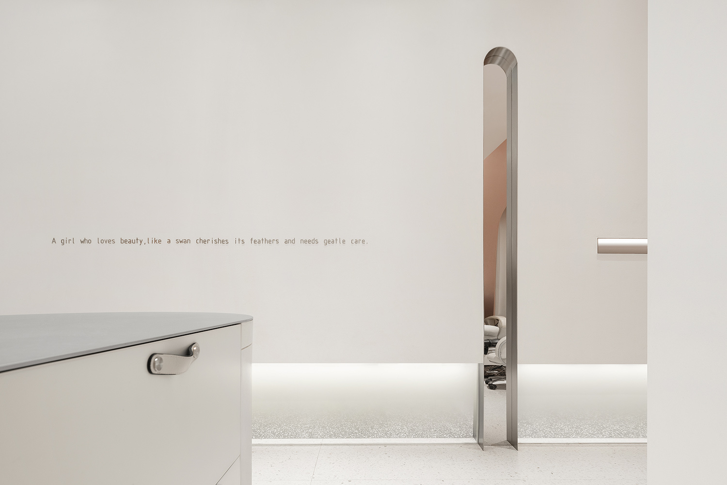
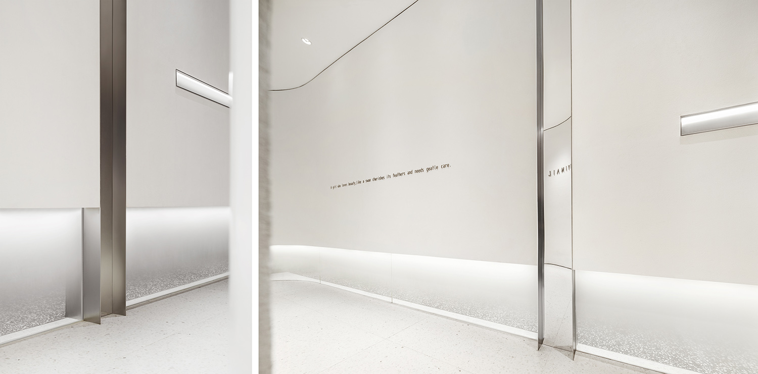
∇ 弧形的牆體將視線引入室內 The curved wall visually leads to the interior
∇ 基於場地條件限製,擯棄了傳統的美甲桌,並替代以更為舒適的休閑按摩椅
Due to the constraints of the site, the conventional manicure table is replaced with a more comfortable massage chair.
∇ 隔斷簾隱藏於彩色隔斷後方,滿足顧客私密性需求
The curtain is partly hidden in the colored partitions to fulfill customers’ needs for privacy.

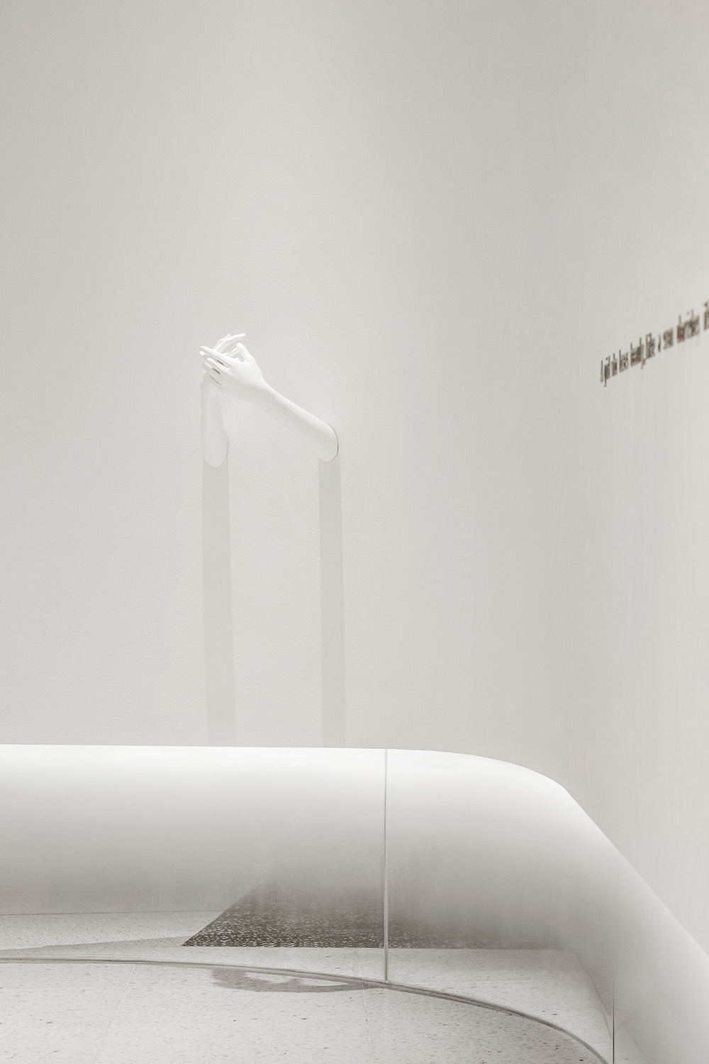
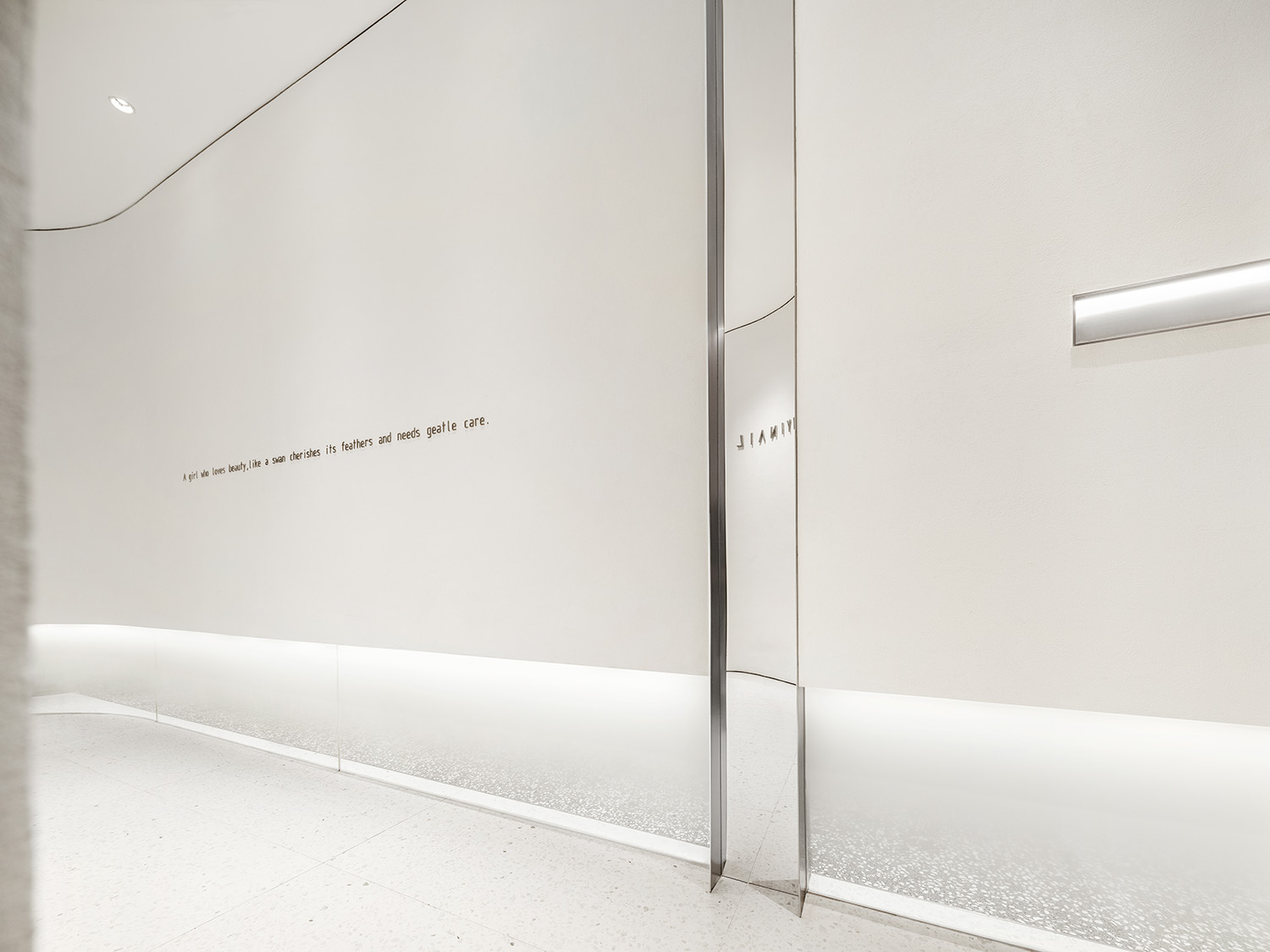
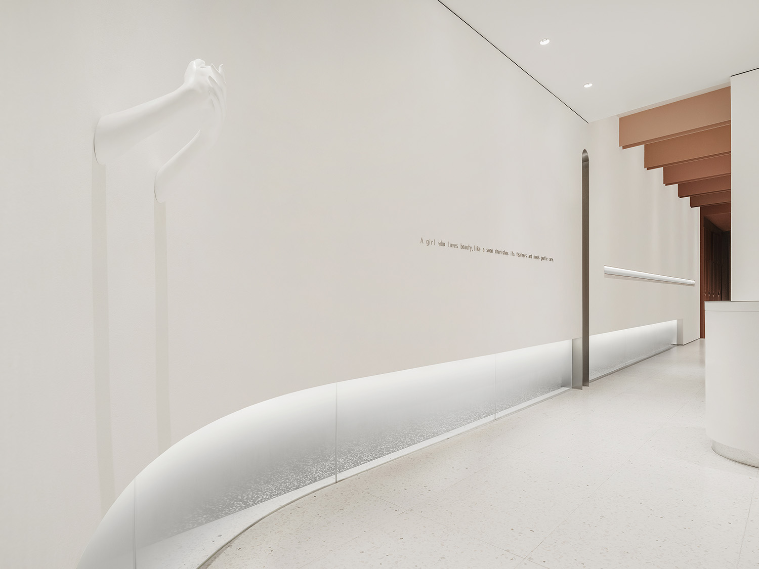
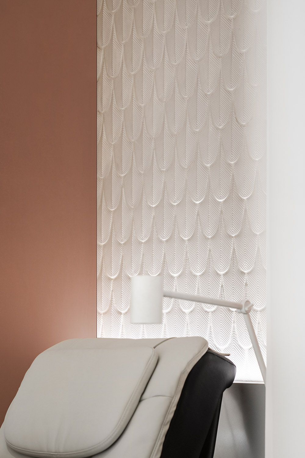
∇ 羽毛狀的牆麵皮膚細節和白色肌理漆回應了空間概念
Feather-like wall details and white texture paint respond to the space concept.
相較於紅、粉色係為主流的女性空間範式,MOC DESIGN將自己對“何為當代女性之美”的獨立思考納入本案的品牌進化中,跳脫單一的風格釋義而注入更多共通的情感。希望這個理性而細膩、根植於現實而創意生長的空間,亦能夠陪伴客群的成長,實現“從媽媽到女兒”的客群迭代。
In contrast to the mainstream colors of red and pink for space for women, MOC DESIGN incorporates the independent thinking on “what’s the contemporary beauty for women” into the branding evolution, breaks out of the box and injects more emotional commonality. It is hoped that the rational and delicate space, rooted in reality and growing with creativity, can accompany the growth of its clientele and accommodate target groups from moms to daughters.
項目信息
項目名稱:海怡美甲深圳萬象天地店
設計單位: MOC DESIGN OFFICE (www.moc-office.com )
主創設計師:吳岫微,梁寧森
設計團隊:胡僑
設計周期:2020.6-2020.9
竣工:2021.1
項目地址:深圳市南山區深南大道華潤萬象天地商場4層
麵積:90㎡
主材:仿水磨石瓷磚、白色肌理漆、杜邦人造石
業主:海怡美甲
攝影師:聶曉聰
Project name: HAIYI NAIL, The Mixc World Shenzhen
Design company: MOC Design Office (www.moc-office.com)
Chief designers: Wu Xiuwei, Liang Ningsen
Design Team: Hu Qiao
Design phase: June-September, 2020
Completion: January, 2021
Location: 4th floor, The Mixc World Shenzhen, Shennan Avenue, Nanshan District, Shenzhen
Area: 90㎡
Main materials: Terrazzo-like tiles, white texture paint, Dupont artificial stone
Client: HAIYI NAIL
Photography: Nie Xiaocong